It’s not enough to just give points or discounts. You’ve got to create an experience that keeps customers coming back.
Your rewards page is the heart of your loyalty program. The way you design it can make or break how well it attracts and keeps customers.
From my time working with Shopify stores, I’ve seen what works and what doesn’t. In this guide, I’ll share my 7 favorite reward page designs and show you how to build something just as effective for your business.
Let’s dive in!
Key Takeaways
- Your rewards page is the heart of your loyalty program. Its design can make or break customer engagement.
- 7 Shopify reward page design examples with practical guidance on how to replicate their success.
- A well-designed page boosts engagement, builds trust, and makes the program feel valuable and worth joining.
- Key design elements: clear point values, visual progress indicators, achievable reward tiers, and mobile responsiveness.
- The best reward pages feel like a storefront for your loyalty program, inviting and easy to navigate.
5 Benefits of a Well-Designed Reward Page
A rewards page isn’t just a static list of points and perks. It’s a powerful tool to engage your customers and make them feel valued. Here’s why it matters:
- Boosts Engagement. Your rewards page acts like the storefront of your loyalty program—inviting and exciting. A visually appealing and easy-to-use design encourages customers to dive in and discover more.
- Clarifies Program Value. A clean, clear layout makes it simple for customers to understand how your program works, what rewards they can earn, and how to claim them. Transparency builds trust and motivates participation.
- Reinforces Brand Identity. An aesthetically pleasing and functional reward page reflects your brand’s values. Customers notice the attention to detail, which leaves a positive impression and strengthens their trust in your business.
- Drives Conversions. A well-designed rewards page can subtly encourage purchases by highlighting the value of loyalty points and showcasing enticing rewards. This creates a continuous loop of spending and rewards, driving sustained sales growth.
- Fosters Community. You can use an appealing reward page to highlight exclusive perks for loyal customers, making them feel valued and creating a sense of belonging and exclusivity for your loyalty program members.
A thoughtfully designed rewards page can be a game-changer for your Shopify store, so make sure to put effort into designing your rewards page to make it stand out!
7 Inspiring Shopify Reward Page Design Examples
A well-designed Shopify reward page should:
- Clearly showcase the program and enticing rewards
- Be visually appealing and on-brand
- Convince customers to participate
- Be mobile-friendly
Based on these criteria, I have curated the 7 Shopify brands with stunning reward page designs that I love! Let’s see what makes them so effective!
Vinamilk
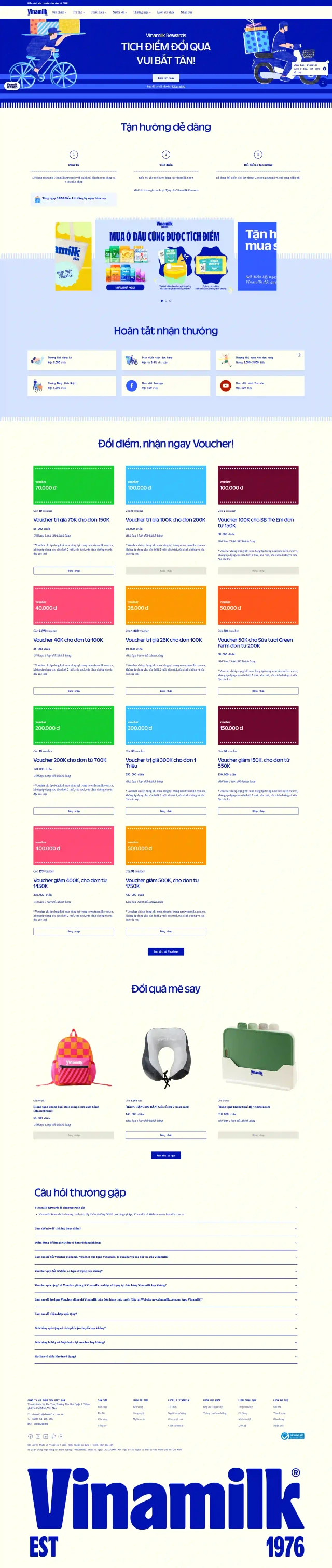
Vinamilk, one of Vietnam’s largest dairy brands, is known for its high-quality milk and dairy products. As a household name, Vinamilk has consistently innovated to maintain customer trust and loyalty – its rewards page is a natural extension of that commitment.
Now, what I love about their approach is how they’ve “gamified” the whole experience. It’s not just a static page with a list of rewards; it’s an interactive journey with different levels and challenges.
Here’s a breakdown of what makes their design so effective:
- Layout & Color Scheme: The spacious, uncluttered layout makes the page easily digestible, while the blue and white palette evokes trust and simplicity. These colors are also strongly tied to the brand’s identity, creating a cohesive visual experience.
- Clear Visual Hierarchy: Essential information – such as how to sign up, how to earn points, and how to redeem rewards – is prioritized and presented in sequential, easy-to-follow sections.
- Product Imagery & Branding: The playful graphics and subtle product visuals keep the brand’s offerings front and center, reminding customers of the tangible benefits behind the rewards.
- Straightforward CTAs: Prominent, well-labeled buttons encourage immediate action, reducing friction for first-time users looking to join.
- Simplicity & Approachability: Instead of overwhelming visitors with overly detailed content, the page focuses on essential steps and benefits. This simplicity makes joining the loyalty program feel effortless, enhancing user confidence and encouraging more sign-ups.
- Mobile-friendliness: The page is responsive and adapts well to different screen sizes, ensuring a positive experience on mobile devices.
AllBirds Korea
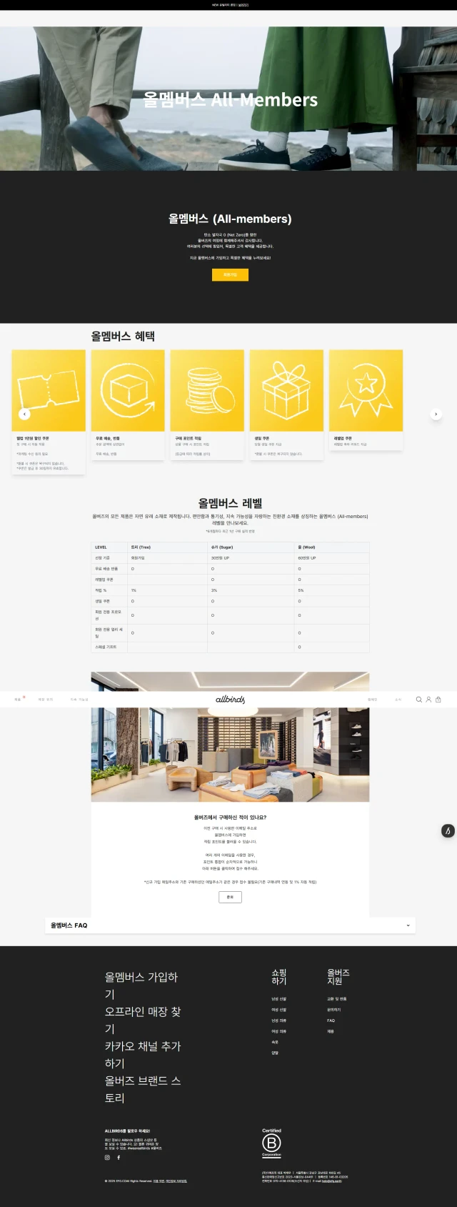
Let’s hop over to South Korea and check out Allbirds, a footwear brand known for its sustainable and comfortable shoes. The brand extends this philosophy of simplicity and eco-mindedness into its rewards program for the Korean market. Its approach to the rewards program is refreshingly simple and clean, which I find incredibly effective.
Here’s what I appreciate about the design:
- Minimalistic Layout: The page embraces a minimalist design with plenty of white space, allowing the information and visuals to breathe. This creates a sense of calm and sophistication, aligning with their brand identity.
- Clear Value Proposition: The benefits of joining their loyalty program are clearly outlined in a concise and easy-to-understand table. They highlight the key perks, such as earning points, redeeming rewards, and getting early access to new products.
- Iconography & Clear Visual Hierarchy: Simple icons help highlight each benefit, breaking text into digestible segments. This improves scalability and ensures customers can quickly find the information they need.
- Straightforward CTAs: Prominent buttons are placed at the top and bottom of the page, keeping the user journey intuitive and encouraging action.
Acrysty Co.
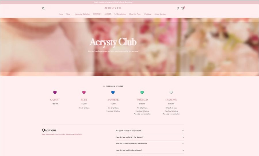
Let’s take a look at Acrysty Co., a lifestyle brand specializing in elegant, modern jewelry crafted with meticulous attention to detail. Their rewards page is a fantastic example of how to make a loyalty program fun and engaging while being as polished as the brand itself.
Here’s what I love about their approach:
- Minimalistic, On-Brand Aesthetic: The clean pink backdrop and refined typography keep the focus on the value proposition. ACRYSTY’s subtle color accents align with its jewelry’s understated elegance, reinforcing brand identity.
- Simple Iconography: By pairing concise text with simple icons, ACRYSTY ensures customers can easily visualize the tangible perks of membership.
- Clear Explanation: Their pop-up on the right side showcases how the rewards program works, how to earn points, and what rewards are available. This transparency helps customers understand the value of joining the program.
- Clear CTAs for Immediate Action: Prominent “Join Program,” “Earn Now,” and “Redeem” buttons are prominently displayed, encouraging visitors to sign up for the loyalty program or take actions to earn rewards and redeem their loyalty points.
- Consistent Brand Messaging: Every element of the page is aligned with ACRYSTY’s luxe, modern brand persona. This consistency encourages customers to deepen their relationship with the brand.
Korean Skincare
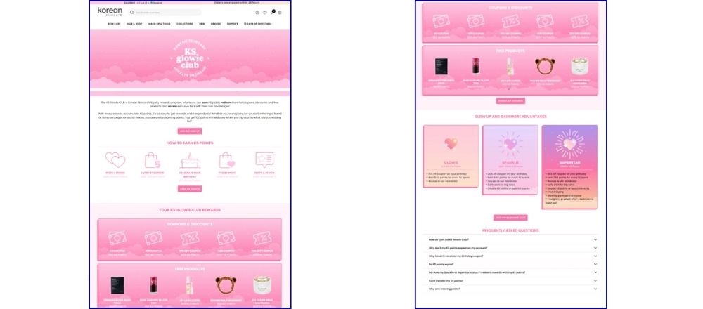
Okay, let’s move on to the beauty sector and check out Korean Skincare, an online store that specializes in (you guessed it!) Korean skincare products. Their rewards page is a fantastic example of how to create a program that’s both informative and visually appealing.
Here’s why I think their reward page design works so well:
- Soothing Color Palette: The use of soft, calming colors mirrors the brand’s focus on skincare and self-care, putting customers in a relaxed mindset and building trust.
- Informative and Engaging: They’ve done a great job of explaining the benefits of joining their rewards program, highlighting the different ways to earn points and the various rewards available. They even include a handy FAQ section to address common questions.
- Simple Icons & Imagery: Small illustrations and product images break up text sections, making information easier to digest. This visual variety also reminds customers of the beautiful products that await them as rewards.
- Tiered System: They’ve implemented a tiered system with different membership levels, offering increasing benefits and rewards as customers progress. This approach encourages customers to earn more points and stay engaged with the program.
- Clear CTAs: Prominent “Join the KS Glowie Club,” “Log in,” and “Earn KS Point” buttons eliminate any guesswork and guide users toward the action.
GlamourUS
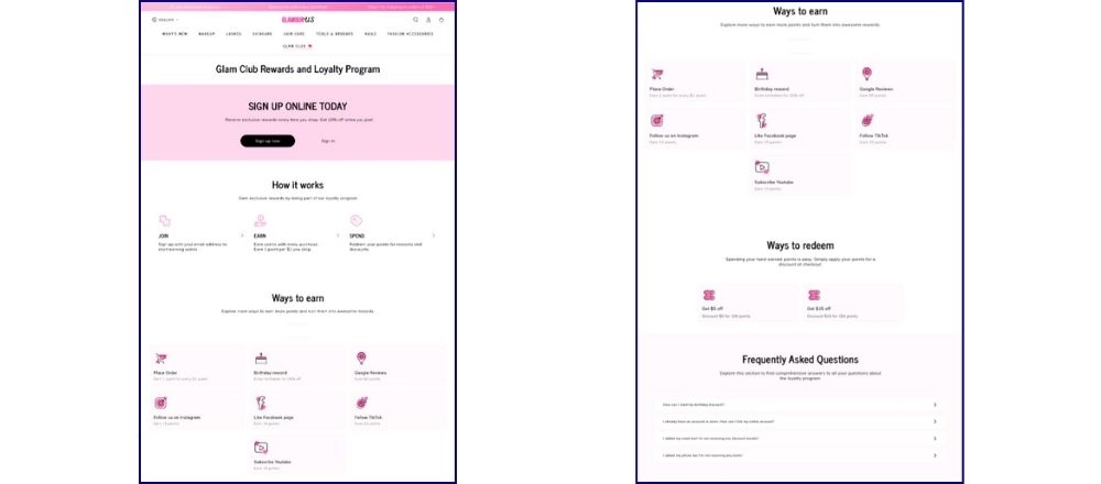
GlamourUS is a brand synonymous with sophisticated beauty and stylish allure, offering a range of cosmetics and beauty products that help customers look and feel their very best. Their loyalty program – aptly named the Glam Club – extends the brand’s elegance and excitement into a rewards experience that keeps customers coming back.
Let’s take a look into the brand’s design Elements & why they work
- Elegant and Chic: The page design is elegant and chic, with a white and pick color scheme and stylish typography that aligns perfectly with their brand aesthetic. It creates a sense of luxury and exclusivity, making customers feel like they’re part of a special club.
- Clear Value Proposition: The benefits of joining their “Glam Club” are clearly outlined, highlighting the perks of earning points, redeeming rewards, and enjoying exclusive access to sales and events.
- Subtle Iconography: Small icons guide the eye, reminding them what rewards can lead to – more of the glamorous items they love.
- Prominent Call to Action: The “Sign up Now” button and the 10% off reward are prominently displayed in a contrasting color, making it easy for visitors to sign up for the program.
KIKOPALS
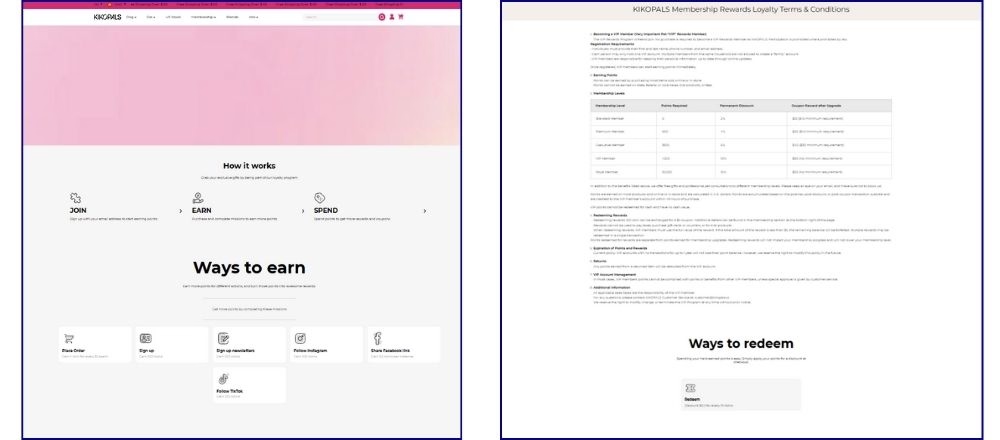
KIKOPALS is a premium pet-focused brand dedicated to improving the lives of pets and their owners through high-quality, stylish, and functional products. Their rewards page is a fantastic example of how to make a loyalty program fun and engaging, especially for a younger audience.
Here’s what I appreciate about their design:
- Playful and Vibrant: The page uses bright colors, playful fonts, and cute illustrations to create a sense of fun and excitement. This aligns perfectly with their brand, which focuses on personalized gifts and quirky accessories.
- Clear Explanation: The page clearly explains how the rewards program works, how to earn points, and what rewards are available. This transparency helps customers understand the value of joining the program and keeps things simple.
- CTA Buttons: Prominently placed “Sign in Now” or “Sign Up” buttons simplify the signup process, ensuring interested customers can immediately take action.
Cool & Simple
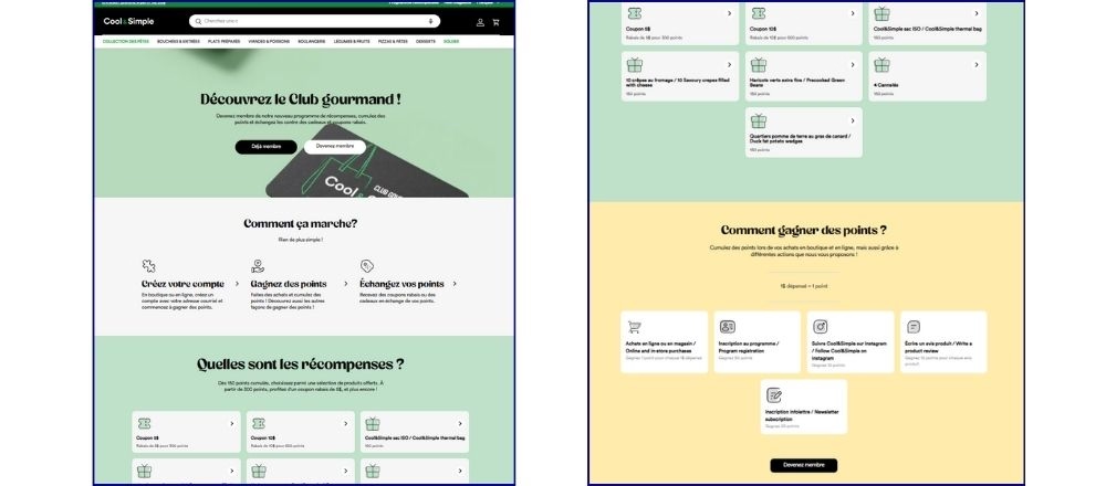
Cool&Simple is a Canadian brand specializing in gourmet frozen foods. It’s a brand that lives up to its name with a minimalist and functional approach to its online store. This brand’s rewards page will give you some insights into how to create a loyalty program that’s straightforward and easy to understand.
Here’s why I find its design effective:
- Visual Cues: They use icons and subtle visual elements to guide the user’s eye and highlight key information. This makes the page more engaging and visually appealing.
- Color Scheme: Soft tones, such as neutral whites with subtle accents, align with the brand’s modern and sophisticated aesthetic.
- Informative and Concise: They clearly explain how the program works, how to earn points, and what rewards are available. The information is presented in concise and easy-to-digest sections
- CTA Buttons: Prominent buttons like “Become a Member” drive action effectively.
How To Replicate These Stunning Shopify Reward Page Examples
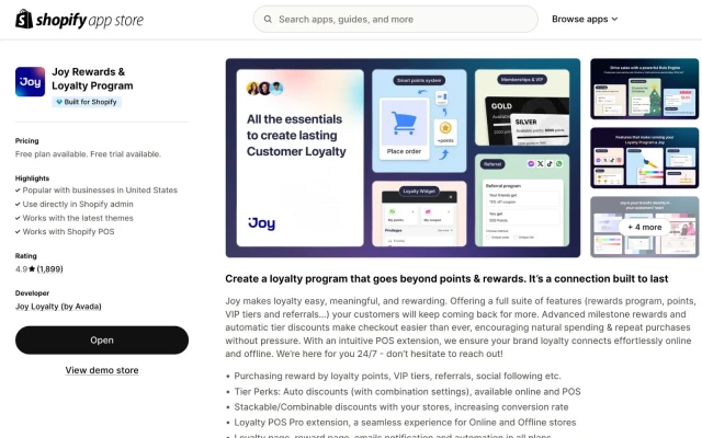
Inspired by these amazing reward page designs? You might be surprised to learn that all 7 of these brands – Vinamilk, Allbirds Korea, Acrysty Co., Korean Skincare, GlamourUS, KIKOPAL, and Cool & Simple – used the Joy Loyalty app to create their stunning reward pages. Joy Loyalty and Rewards makes it incredibly quick and easy to design and launch a beautiful, branded rewards page that integrates seamlessly with your Shopify store.
Here’s a simplified guide to get you started:
Step 1. Install the Joy Loyalty App
- Configure your loyalty program by enabling features like points earning, redemption, and referrals.
Begin by installing the Joy Loyalty app from the Shopify App Store.
Step 2: Generate Your Loyalty Page
- Navigate to the Embedded Content menu in the Joy Loyalty app.
- Click Generate Loyalty Page to create your page in Shopify.
- Set a custom slug for the page in the popup window, or use the default slug: /joy-loyalty-page.
Note:
- If you already have a loyalty page named “loyalty-page,” generating a new page will convert it to “joy-loyalty.”
- Creating another page based on “joy-loyalty” will link it to the previously generated page.
Step 2: Add Content to the Loyalty Page
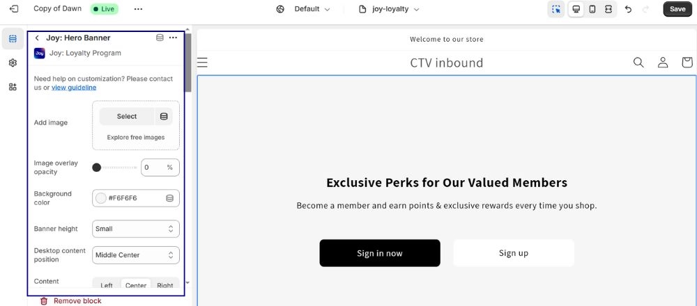
- Choose Apps.
Click on any block you want, such as the Hero Banner Block, and customize colors, buttons, and layout alignment. Upload your banners and icons, or choose from Joy Loyalty’s built-in designs.
Add blocks to structure your Loyalty Page:
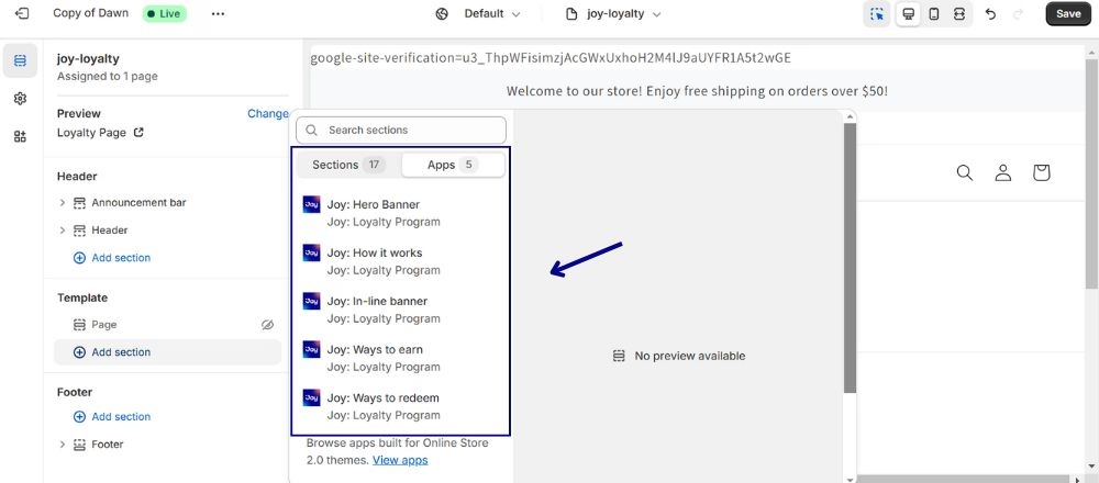
Click Add Section from Template in the theme editor dashboard.

In the Embedded Content, click Edit in Theme Editor.

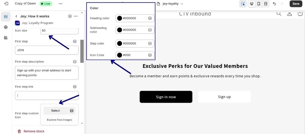
Step 3: Customize Icons
Certain blocks, such as “How To Work” or “Way To Earn,” include icons. Joy makes it easy – just click to select the icon image you prefer or use Joy’s built-in icon designs. You can also customize the size and color to suit your needs.
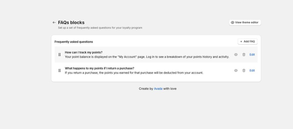
Step 4: Add FAQs and Additional Theme Blocks
- Use the Joy FAQs Block or your theme’s FAQ block to add clarity.
- Optionally, include theme blocks like video or collage for a more engaging experience.
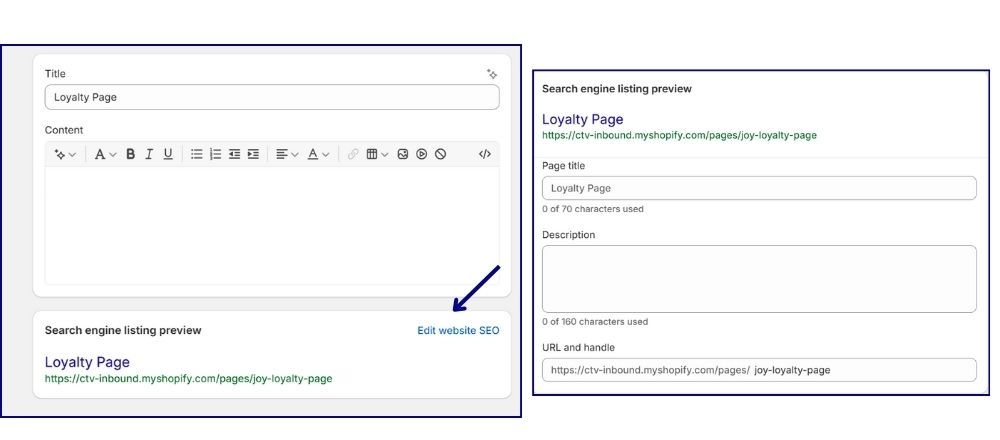
Step 5: Update SEO Settings
Save your changes and submit the page for Google indexing.
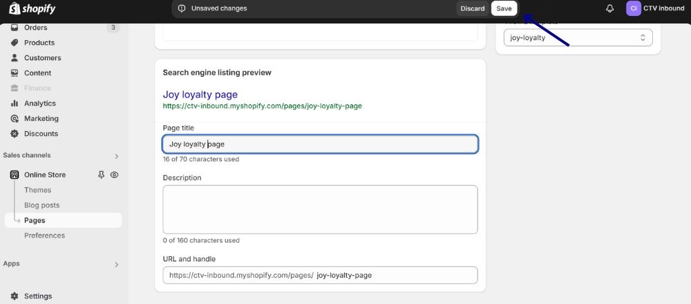
Click Edit Website SEO to update the title, meta description, and handle.
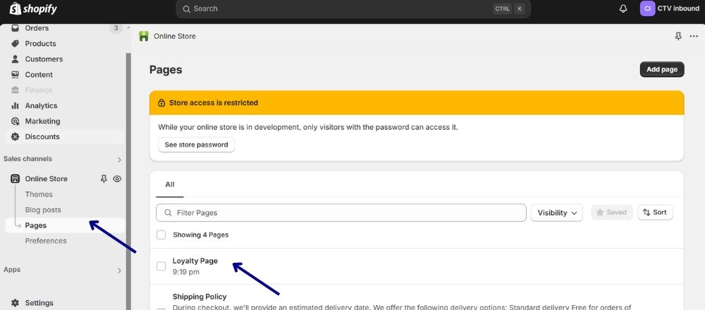
Go to Shopify Admin → Online Store → Pages and select your Loyalty Page.
Create Your Shopify Reward Page That Keeps Customers Comming Back
A well-designed reward page can significantly boost customer engagement and loyalty, as highlighted by the examples above.
Joy Rewards & Loyalty Program makes it easy for Shopify merchants to create and launch a beautiful, functional rewards page that encourages repeat purchases and enhances the overall customer experience. With its user-friendly tools, Joy simplifies the process of designing, customizing, and managing a rewards program.
Start your loyalty program with Joy today and create a rewards page that keeps customers coming back for more.