Most loyalty dashboards are good at showing you activity: points issued, members signed up, and rewards claimed. Far fewer help you answer the question your finance team actually asks: Is this program making money?
That gap matters more than it sounds. McKinsey's 2024 analysis of loyalty and pricing found that roughly two-thirds of established loyalty programs fail to deliver value, and some quietly erode it. A program can look busy, with points flying out and sign-ups climbing, and still hand out more in rewards than it earns back. The only way to tell the difference is to measure the right things.
This guide walks through the loyalty program metrics that prove ROI: what each one means, how it's calculated, and how to read it. Throughout, we'll point to Joy's loyalty analytics dashboard, an in-depth reporting workspace built specifically for measuring a loyalty program, as the concrete example, so the formulas don't stay abstract.
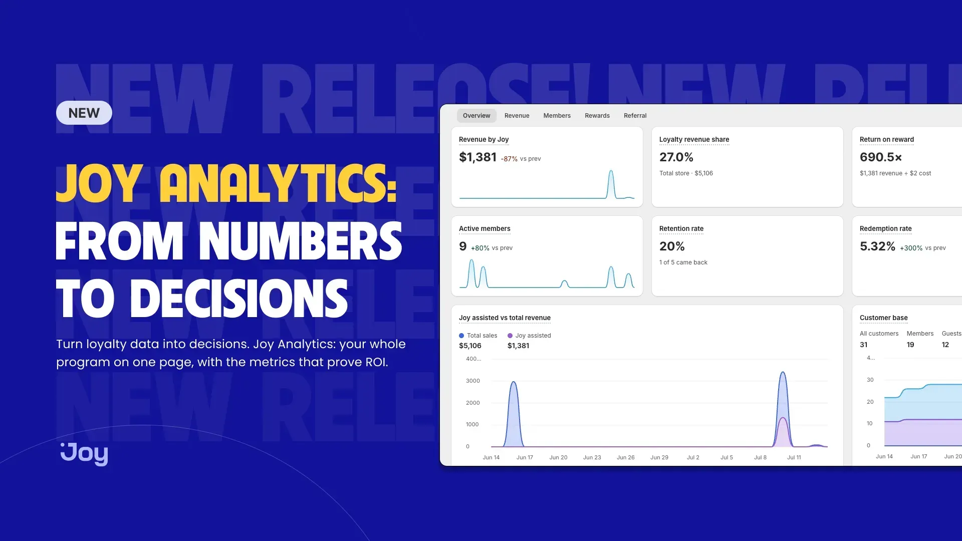
Joy Analytics - your whole loyalty program: five tabs, one shared filter
What loyalty program metrics really measure
Loyalty program metrics are the numbers that show whether your points, tiers, and rewards are changing customer behavior in ways that pay off.
They fall into two camps, and confusing them is where a lot of programs go wrong:
- Engagement metrics describe activity: how many people joined, how many points got issued, and how many rewards were claimed. They're useful, but easy to inflate, since a program can pump them up by giving away value it never earns back.
- Outcome metrics describe money and behavior: revenue tied to the program, the additional amount a member spends compared to a non-member, and the cost of the rewards that fund it. These are the ones that prove ROI.
You need both, but you should lead with outcomes. Engagement tells you the program is being used; outcomes tell you it's worth running. If you only track one side, track the money.
The encouraging part is that when programs are measured honestly, most do pay off. Antavo's Global Customer Loyalty Report 2025 found that 83% of program owners who measure ROI reported a positive ROI, averaging 5.2x revenue over cost, up from 4.8x the year before. The catch is in that phrase, who measures ROI: you can't land in the 83% if you never do the math.
The four questions your metrics need to answer
Rather than drowning in a dashboard, it helps to organize loyalty metrics around four questions, each building on the one before. Answer all four, and you have a real ROI picture, not just a wall of numbers.
- Is it making money? Revenue the program touches, measured against what the rewards cost.
- Is it changing behavior? Whether members and redeemers actually spend more than everyone else.
- Is it healthy? Whether people join, stay active, and redeem, or drift away and leave points rotting.
- Is it growing the base? Whether happy members bring in new customers through referrals.
Let's take them in order, because the metrics stack the same way.
Question 1: Is it making money?
This is the ROI layer, and it rests on three metrics.
Revenue attributed to loyalty (and its share)
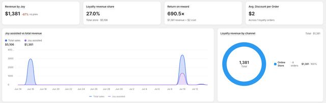
Start with the headline: how much revenue runs through orders that use the program. In Joy, this shows up as Revenue by Joy on the Revenue tab, the total sales from orders where a customer earned or redeemed with the loyalty program, shown with the change from the previous period.
On its own, a big number feels good but lacks context. That's what Loyalty Revenue Share adds:
Loyalty Revenue Share = Loyalty-assisted revenue ÷ Total store revenue
If loyalty-assisted orders make up 28% of your revenue this quarter versus 22% last quarter, the program is pulling more weight over time. Share matters more than the raw figure because it scales with your store: a growing dollar amount can still be a shrinking slice if the rest of the store grew faster.
Return on Reward: the closest thing to a single ROI number
Return on Reward answers the blunt question: for every dollar we spend on rewards, how much revenue comes back?
Return on Reward = Loyalty-assisted revenue ÷ Reward (discount) cost
Say that over a quarter, loyalty orders generated $60,000 in sales, and the discounts and rewards those orders redeemed cost you $4,000. Your Return on Reward is 15x, meaning every dollar of reward is tied to fifteen dollars of loyalty-assisted revenue. Joy surfaces this on both the Overview and Rewards tabs, with the underlying revenue and reward cost shown so you can see what's driving the ratio.
There's one honest caveat, and it's the most important line in this guide: not all of that revenue is incremental. Some of those customers would have bought anyway. So while Return on Reward is a strong directional signal and the fastest ROI read you'll get, it tends to flatter the program. To know how much spending is genuinely extra, you need the next layer.
Question 2: Is it changing behavior?
This is where you separate a program that rewards behavior from one that changes it. The method is comparison: hold your members up against your non-members, and your redeemers against everyone who never claims a reward.
AOV Lift
AOV Lift = (Member average order value − Non-member AOV) ÷ Non-member AOV
If members spend $85 an order and non-members spend $68, that's a 25% lift. Joy shows this directly as AOV Lift on the Overview tab and in a fuller side-by-side comparison on the Revenue tab, which compares members and non-members across average order value, repeat purchase rate, orders per customer, and customer lifetime value.
Customer lifetime value, compared
A single order tells you little. Customer Lifetime Value (CLV) tells you what a relationship is worth over time:
CLV = Average order value × Purchase frequency × Customer lifespan
For ROI, the number that matters isn't member CLV alone, but the gap between members and non-members. When a member is worth $400 over two years and a non-member is worth $250, that $150 difference is the case for every dollar you spend keeping members happy. If you want the full breakdown of reading and improving this metric, our guide to customer loyalty analytics goes deeper.
Redeemers versus non-redeemers
Here's a distinction most stores miss: signing up isn't the behavior that pays off. Redeeming is. Joy's Redeemers vs. Non-Redeemers comparison tracks lifetime AOV, repeat purchase rate, orders per customer, and CLV for people who've actually claimed a reward, compared with those who haven't.
This lines up with what McKinsey's 2024 research found: top-performing programs can raise revenue from customers who redeem points by 15 to 25% a year, by lifting either how often they buy or how much they spend per order. In other words, the act of redeeming is what brings a customer back into the store. A program where lots of people earn points but almost nobody redeems is therefore a warning sign, not a savings.
Still, one caution is worth stating plainly: members spending more than non-members is correlation, not proof of cause. Your best customers are the most likely to join in the first place. The member-versus-non-member gap is a genuinely useful signal, but treat it as evidence, not a verdict. The stronger test is whether the gap widens after someone joins, which is far harder to fake.
Question 3: Is it healthy?
Changing behavior is necessary, but it isn't the whole story. A program can post decent revenue today and still be quietly unwell, so these metrics check the foundations, and one of them is a cost hiding in plain sight.
Enrollment, activation, and retention
Three metrics track whether the program is alive:
- Enrollment Rate is the share of customers who join. Low enrollment usually means the program is hard to find, or the first reward feels too far away.
- Activation Rate is the share of members who do something beyond signing up. A pile of dormant sign-ups flatters your member count and nothing else.
- Retention Rate is the share of past customers who come back. It's the metric loyalty exists to move, and it's worth reading alongside our deeper piece on loyalty program retention rate.
One practical note, if you're reading these in Joy: Retention Rate is calculated all-time and ignores the date filter, so it won't swing with your chosen range the way revenue metrics do. That's by design, because retention is a long-arc number, not a weekly one.
Redemption Rate
Redemption Rate = Points redeemed ÷ Points earned
This is the pulse of a points program. A healthy redemption rate means customers see the rewards as reachable and worth chasing. A low one means they're earning points they never spend, which feels like a saving but is really a liability waiting to come due. We cover the healthy ranges and how to nudge them in our guide to loyalty program redemption rates.
Breakage: the metric that looks like a win and isn't
Breakage Rate = Points that expire unused ÷ Points issued
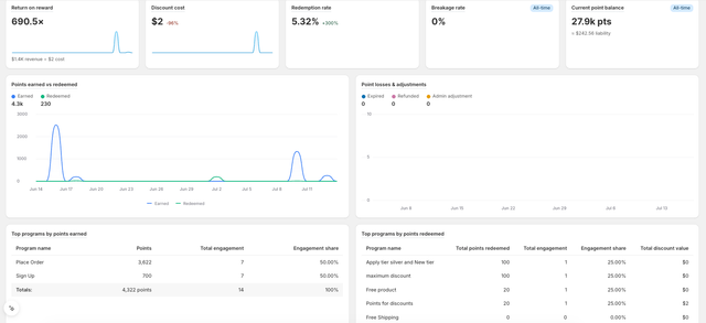
Unredeemed points sit on your books as a liability, a promise of value customers haven't cashed in yet. Joy shows these two ways: Breakage Rate, the share of points expiring unused, and Current Point Balance, the total points in circulation with their monetary value attached.
It's tempting to read high breakage as money saved. It isn't. High breakage almost always means the rewards aren't compelling or reachable enough to bring people back, and a reward nobody redeems is a reward that changed no behavior. The scale is bigger than most stores assume: Antavo's Global Customer Loyalty Report 2026 found that 27% of the points customers earned in 2025 went unspent. More than a quarter of the value you promised sits unclaimed, and that's not a saving; it's engagement that never happened.
Question 4: Is it growing the base?
A healthy program does more than hold on to customers. At its best, it brings in new ones, and the cheapest new customer is one an existing customer brings you. That's what referral metrics measure: whether your program turns members into a growth channel.
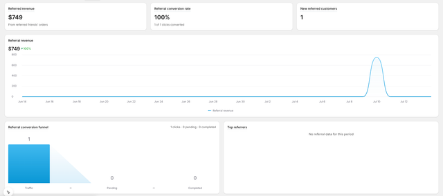
- Referred Revenue is the sales generated by orders from referred customers. It's the clearest "the program made us money we wouldn't otherwise have" number, because these are customers who arrived through the program.
- Referral Conversion Rate is the share of referral clicks that turn into completed orders, usually shown as a funnel from traffic to pending to completed. A wide top and a narrow bottom point to a specific fix: the offer, the landing page, or the checkout friction.
Because referral revenue tends to carry a low acquisition cost, it's one of the more flattering lines in any loyalty ROI calculation. For that reason, it's worth watching on its own tab, not buried in a blended total.
Putting it together: how to actually calculate loyalty ROI
We've read these metrics one at a time; now they combine into a single figure. Return on Reward is the fast read, but a fuller ROI calculation subtracts the whole cost of running the program, not just the rewards:
Loyalty ROI = (Incremental revenue − Total program cost) ÷ Total program cost × 100
Where:
- Incremental revenue is the extra revenue from members you wouldn't have earned otherwise. The honest way to estimate it is to take the member-versus-non-member spending gap, not total member revenue.
- Total program cost includes reward and discount cost, the app subscription, and the time your team spends running it.
Here's a simplified example, and the figures are illustrative rather than benchmarks. Say your members generated $120,000 this quarter, and a comparable non-member group would have spent an estimated $95,000, so roughly $25,000 is incremental. If your program cost $6,000 all in (rewards, app, admin time), then ROI = ($25,000 − $6,000) ÷ $6,000 × 100 = 316%.
That estimate rests on your incremental figure, which is the hardest and most arguable input, so don't chase false precision. The point isn't a number to the decimal; it's a defensible answer to "is this worth it," reviewed each quarter against your own trend. For a fuller walkthrough of the math and the levers behind it, see our dedicated guide to loyalty program ROI.
Reading it without a spreadsheet
You don't have to assemble any of this by hand. This is exactly what a purpose-built loyalty analytics dashboard is for: it attributes revenue and reward cost for you, so the ROI math is already done when you open it.
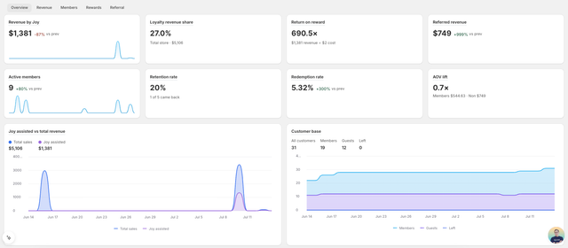
Joy has an in-depth analytics dashboard built specifically for this. Rather than a generic store reporting bolted on, it's a loyalty analytics workspace that answers the four questions above across five dedicated tabs:
| Tab | The question it answers | Metrics you'll find |
|---|---|---|
| Overview | Quick health check | Revenue by Joy, Return on Reward, Retention Rate, AOV Lift |
| Revenue | Is it making money? | Loyalty Revenue Share, revenue by channel, members vs non-members |
| Members | Is it healthy? | Enrollment, activation, retention, cohort retention, tiers |
| Rewards | What are rewards costing? | Redemption Rate, Breakage Rate, point liability |
| Referral | Is it growing the base? | Referred Revenue, referral conversion funnel, top referrers |
Four things make it a tool you act on rather than just look at:
- Every metric explains itself. Hover any number and a tooltip lays out what it means, how it's calculated, what to watch out for, and a tip to improve it. That way, a metric you've never read before doesn't stay a mystery, because a number you can't interpret is a number you won't act on.
- One filter controls every chart. Set a date range (last 7, 30, or 90 days, all-time, or custom), a VIP tier, or a Shopify customer tag once, and the whole dashboard updates together. A couple of metrics like Retention Rate and point liability stay all-time on purpose, since they only make sense over the long arc.
- It goes deep where the "why" lives. You get cohort retention as a month-by-month heatmap, an engagement funnel from members to repeat redeemers, Return on Reward with the underlying revenue and cost exposed, and tier-by-tier performance. These are the views that explain a number, not just report it.
- You can reshape and export it. Add or hide widgets per tab, build custom metrics, and export any date range to a multi-sheet Excel file that ships with a data dictionary. As a result, sharing with your finance team doesn't mean re-explaining every column.
That's the real difference between a number and a decision: the dashboard puts the metric, its meaning, and the next action side by side.
Once it's set up, a simple review cadence keeps it manageable:
- Weekly: Revenue by loyalty and its share, new members
- Monthly: Return on Reward, redemption rate, AOV lift, referred revenue
- Quarterly: Retention rate, cohort retention, CLV gap, full ROI calculation
Whatever the cadence, pick the handful you'll actually act on. A short list you check every week beats a sprawling dashboard you open twice a year.
The vanity metrics to stop celebrating
Because every layer above can be gamed, it's worth naming the numbers that feel like progress and aren't:
- Total members. Sign-ups mean nothing without activation, so a hundred thousand dormant members is a number, not an outcome.
- Points issued. This measures how much value you gave away, not how much you earned, so pair it with redemption before you cheer.
- High breakage. As covered above, unredeemed points are a form of disengagement, wearing the costume of a saving.
- Return on Reward with no incremental check. A 15x ratio is meaningless if most of those customers would have bought anyway, so always read it next to your member-versus-non-member lift.
The through-line is simple: every metric should tie to a decision. If a number won't change what you do next quarter, it's decoration.
Frequently asked questions
What is the most important loyalty program metric?
There isn't a single one, but if you had to start with two, use Return on Reward for a fast ROI read and AOV Lift (members versus non-members) to check the program is actually changing behavior. One tells you the program pays off; the other tells you why.
How do I calculate loyalty program ROI?
Subtract total program cost from the incremental revenue members generate, divide by total program cost, and multiply by 100. The hard part is the incremental figure, so estimate it from the spending gap between members and a comparable non-member group, not from total member revenue.
What's a good redemption rate?
It varies by program design, but the direction matters more than the exact figure: you want enough redemption for customers to come back and spend points. Very low redemption paired with high breakage usually means your rewards feel out of reach.
Are members spending more proof that the program works?
Not by itself. Your best customers are the most likely to join, so some of that gap is selection, not cause. The stronger signal is whether a customer's spending rises after they join, and whether redeemers outperform non-redeemers over time.
Where do I find these metrics?
A dedicated loyalty analytics dashboard is the simplest path, since it attributes revenue and reward cost for you. In Joy, they live across the Overview, Revenue, Members, Rewards, and Referral tabs, each with tooltips and export.
From dashboard to decision
Loyalty program metrics aren't about filling a report. They're about answering one honest question on a regular schedule: is this program earning more than it costs, and is it changing what customers do?
Start with the money. Read Return on Reward and Loyalty Revenue Share, then check the member-versus-non-member lift to see how much of that revenue is genuinely extra. From there, add retention and redemption to confirm the program is healthy, keep an eye on breakage so points don't rot, and let referral revenue show you the growth it drives for free.
The stores that get the most from loyalty aren't the ones with the busiest dashboards. They're the ones that measure the few numbers that prove it's working, and then act on them.



-68d473.webp?width=828&q=80&f=webp&auto=format)