

"I've got thousands that need updated." - Oliver, Brewser, in a support ticket about 30,000 customer records
CHALLENGE
A loud brand with a quiet rewards program
Brewser is a UK craft beer subscription that calls itself "the beer subscription that gives a damn." Beer ships straight from independent UK breweries to the door, and the site looks as loud as the cans inside them: electric yellow, cobalt blue, thick black outlines, buttons with hard offset shadows. The style has a name, neo-brutalism, and Brewser commits to it on every page.
The loyalty mechanics went in fast. The look didn't. Two weeks later, the widget still wore Joy's defaults, and the default tier icons clashed with everything around them.
Brewser had also switched off one widget feature on purpose. Recommended products showed the one-off price of a box, not the subscription price customers actually pay:
"I've attached a couple of screenshots to highlight why I removed recommended products originally from the widget. It's because it shows the one-off price, not the discounted subscription price." - Oliver, Brewser
SOLUTION
Widget first, then the page
On May 2026, Joy's onboarding team offered Brewser a free design setup, and Brewser granted theme access the same day. The request was for the loyalty page. Joy started with matching the widget to the store instead, because every customer sees the widget on every page, and at that point it was the least on-brand thing on the site.
A widget that belongs to Brewser
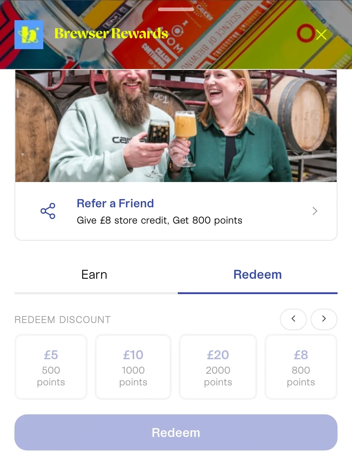
The Joy widget opens as a drawer under a header of Brewser's own can artwork, with the Brewser Rewards name set in yellow. Each card carries a real photograph: a box on a doorstep with a dog peering out, two brewers raising glasses among barrels. Points values sit next to a small cartoon beer mug instead of a generic coin, and the buttons use Brewser's cobalt blue. The launcher in the corner is a yellow pill with the same mug on it.
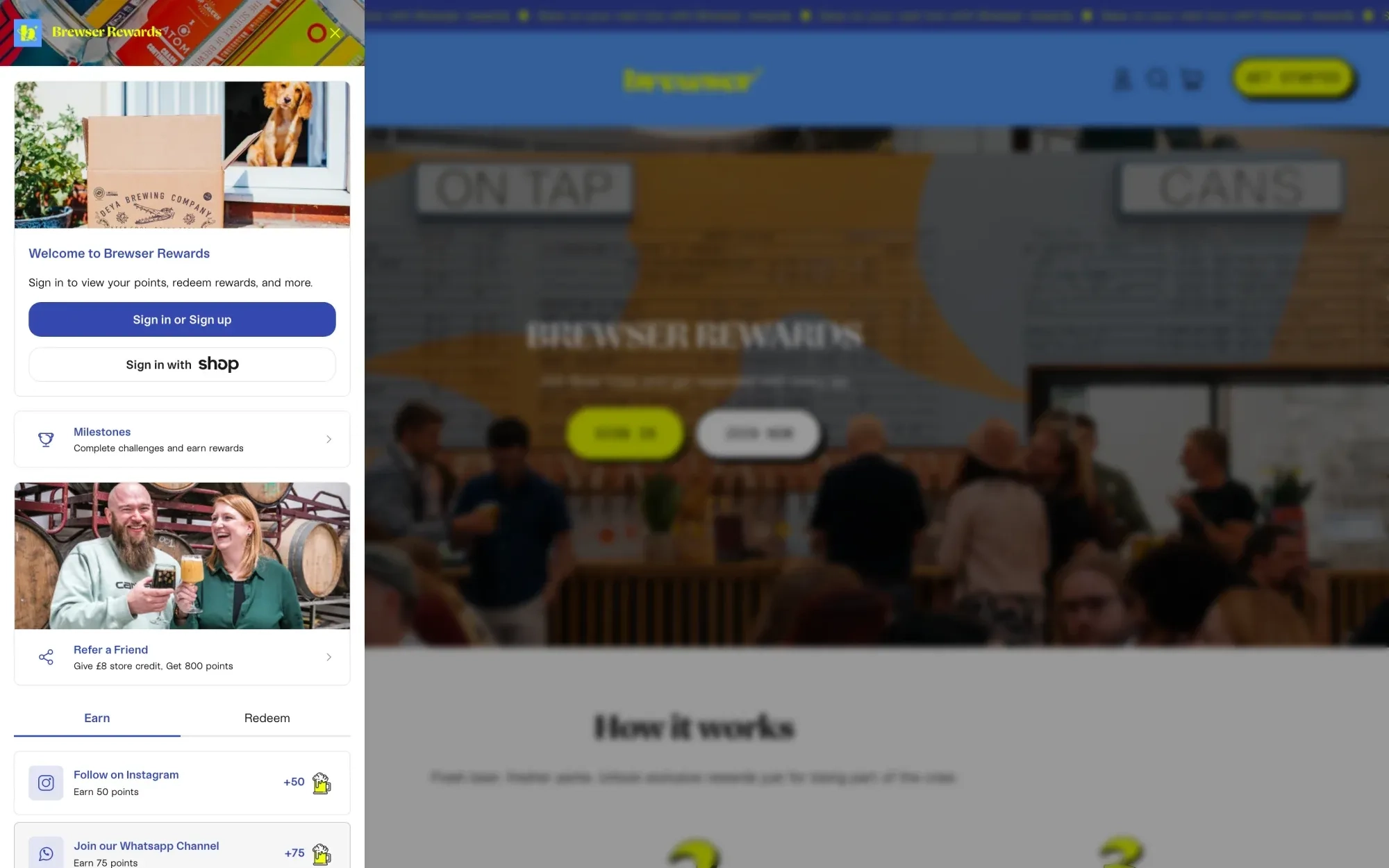
The widget is the one place the style softens. Its cards stay rounded, without the hard black shadows the rest of the site uses.
Photography ages on its own schedule. The first widget header featured a blue can that Brewser warned was a limited edition and would soon sell out. So Joy pointed Brewser to the widget design settings where they swap the imagery themselves whenever a can sells out.
Subscription prices, not one-off prices
The recommended-products problem came down to how Brewser prices a box. Their theme shows every box "from" its lowest subscription price, such as £29 or £38. Joy's widget read the standard product price. Joy changed the widget to show the subscription price the way the theme does, and told Brewser the next day. The feature Brewser had turned off was ready to switch back on.
A rewards page in Brewser's own type
With the widget done, the team rebuilt the Brewser Rewards page from Joy's loyalty page blocks and moved it onto Brewser's new live theme on 2 July. It opens with a photo of a busy taproom and two buttons, Sign in and Join now.
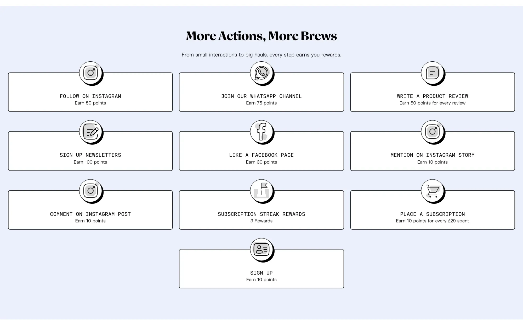
Every block uses Brewser's own fonts: Meek Display for headings, Basier Circle Mono for labels, Kern for body text. The ten ways to earn sit on white cards with thin black borders, each with a round icon badge dropped onto the top edge. The list is built for how a subscription brand actually grows: join the WhatsApp channel, follow on Instagram, write a review, plus points on every subscription order and rewards for subscription streaks.
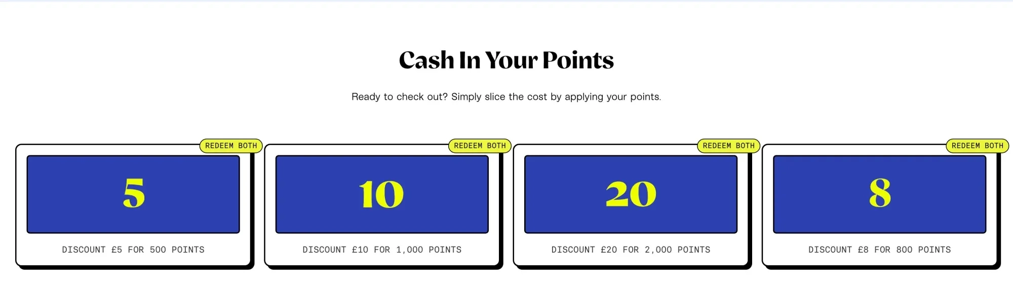
Redemption is where the page commits hardest. Each reward is a cobalt tile with the discount set large in yellow, framed by a thick black border and a hard shadow, with a small yellow tag on the corner.
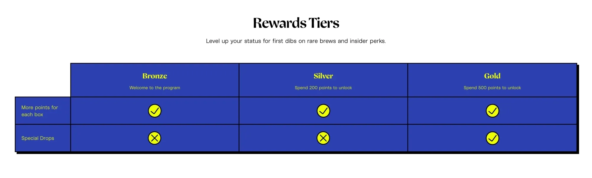
Tiers read as a comparison table instead of three separate cards, so a member sees at a glance that Gold unlocks special drops. In the widget, Joy replaced the default tier icons, which had clashed with everything around them.
On a phone, the widget carries the same program in two tabs, Earn and Redeem, with the referral offer above them: give a friend £8 in store credit, get 800 points.
RESULTS
Members who redeem keep coming back
Over the last 12 months, Brewser customers who redeemed points behaved very differently from those who hadn't, according to Joy Analytics:
- 4.44 orders per customer for members who redeem, against 1.61 for those who don't.
- £172.56 in lifetime value against £60.55.
- 93.1% repeat purchase rate against 38.7%.
Redeemers were already among Brewser's keenest subscribers, so these figures show who the program keeps close rather than proving it created that loyalty. For a subscription business, that is the group worth keeping.
A rewards page another brand asked for
On 2 August, a different brand onboarding with Joy sent its loyalty page brief. The list of reference pages included brewser.beer/pages/brewser-rewards.
Brewser's program now runs as one system across the site:
- One visual language from the launcher to the rewards page, in Brewser's colours and fonts.
- Ten ways to earn, from social follows to subscription streaks.
- Subscription pricing shown correctly in the widget.
- Tier progress matched to earned points for roughly 30,000 customers.
Why it worked
Brewser's style is the product, as much as the beer is. A rewards program in default styling would have been the only generic thing on the site. Joy put the widget first because it appears on every page, then rebuilt the rewards page in Brewser's own type and colour. When the brand's look changes, Brewser changes the program with it.
Running a subscription brand where the default loyalty look doesn't fit? Book a demo and bring your brand guidelines.