Skip to content
Product update

Your loyalty widget now takes its look from your storefront

Joy now reads your storefront and matches the widget to it — colors, button style, fonts, logo and copy. You review every value before it applies.

Thomas NguyenThomas NguyenUpdated
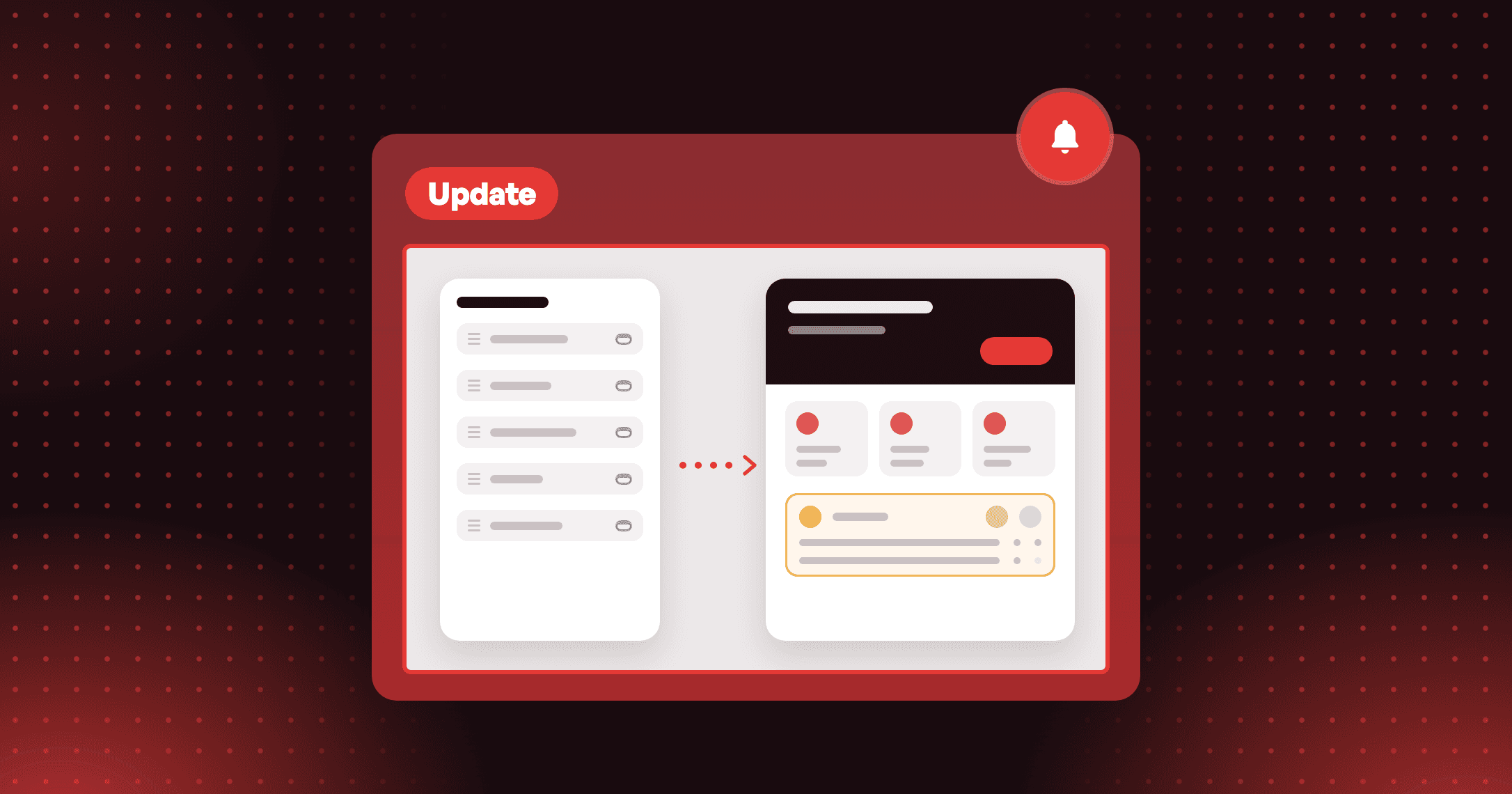
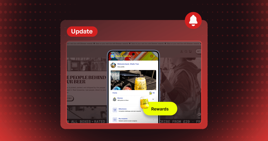
Joy Update card: a storefront being scanned, its colors carried over to a loyalty widget restyled to match
3 min read

Summarize this post with AI

Hover over the Add to cart button on one of your product pages. If your theme was built with any care, something happens. The fill drains to an outline, or a panel of color sweeps across it from the left. Somebody chose that, and it is part of how your store feels.

Now open your loyalty widget and hover over its button. It gets a shade darker.

Customers register that gap even when they have no word for it. A panel that does not look like the store reads as someone else's app sitting on top of it, and an app that looks borrowed is an app people close.

That gap now closes with one scan.


Point Joy at your storefront and the widget follows

On-brand, shipped in Joy 1.202 this September, reads a page of your storefront and maps what it finds onto the Unified Widget. You choose which groups to apply: Colors and theme (palette, button style, corner radius, the fonts your theme uses), Logo and images (logo, avatar, hero image), and Content voice — the widget's text, rewritten to match how your brand speaks, in the language you pick.

Colors come back by role. Detected design lists six: button and accent, button text, widget background, a secondary brand color, body text and heading text. Each lands where the widget uses it, and each stays editable before anything applies.

Nothing reaches your storefront until you click Apply changes and save the widget. Your theme is never modified — On-brand only reads it.

It reads the button the way a shopper sees it

Back to that hover. On-brand takes the theme from the page you enter, then opens one of your product pages, where the real call to action lives, and reads the primary button there with its hover state included.

If your button turns transparent on hover, the widget's buttons do the same. If it sweeps a color panel across itself, the widget reproduces the sweep as an animation rather than flattening it into a color swap.

Much of what makes a store look like itself was decided by whoever built the theme: how the button is painted, whether the hero is a photo or a video, which CSS color format the palette is written in. On-brand works from what the theme actually renders. A video hero gives it the video's poster image. A palette written in oklch gets converted.

Some pages still have no primary button On-brand can read. When that happens, it skips the button and accent color, and the rest of the scan still applies. Entering a product page URL picks the accent color up.


What you can do with it

Re-match the widget after a theme change. Run the scan again on the new theme instead of re-picking six colors by hand.

Give the widget copy your brand's voice. On-brand writes a Brand overview of what your store is about and rewrites the labels from it. If the copy misses, edit the overview and click Generate again.

Scan the storefront customers actually visit. A headless storefront or a page on a subdomain can be scanned too. A storefront password unlocks your own store's domain for that scan only, and is never stored.

Keep the button tied to the store. The Button style setting in the Design panel offers Match store theme, a Joy preset (Solid, Outline or Soft), or Custom.

If you want the widget to stand apart from your store on purpose — a loyalty program with a look of its own — On-brand is the wrong tool for you. The Design panel is where you stay.


How to set it up

Step 1 — Open the On-brand tab. On-site content → Unified widget → On-brand, or use the Match the widget to your store banner in the Design panel. Full guide.

Step 2 — Enter the page to read. Your home page works best. If your storefront is password-protected, add the storefront password.

Step 3 — Choose what to apply, then click Generate. Tick the groups you want and set the language. On-brand names each stage as it runs. Click Stop and nothing changes.

Step 4 — Review, then apply. Adjust any detected color or rewritten label in the live preview, click Apply changes, and save the widget to publish.

On-brand is marked Beta and runs on stores using the Unified Widget.


A widget that looks borrowed gets treated like one

The widget is where your loyalty program meets the customer. Points get checked there and rewards get redeemed there, and the loyalty discount code a customer takes from it is what counts their next order as an Assisted Order.

It is hard to earn a second click from a panel that looks like it belongs to another company. Until now, matching it meant copying hex codes out of your theme editor one field at a time.

Your loyalty program should look like the brand your customers are loyal to.

Open the On-brand tab, enter your home page, and hover over the preview's button before you apply.


Ready to turn retention into real growth?

Join the future of loyalty today. With our omnichannel platform, you can connect with customers across every touchpoint, reward their engagement, and build lasting relationships that drive growth. Request a demo · Get started free

Thomas Nguyen

Written by

Thomas Nguyen

Thomas Nguyen is the CEO & Co-founder of Joy, a loyalty solution for Shopify and eCommerce brands. With years of experience building high-performance Shopify apps, Thomas aims to help merchants grow through customizable and retention-focused tools.

Stop being ordinary. Start leading

20,000+

Brands run loyalty on Joy

4.9★

Shopify App Store rating

1,689

Merchant reviews