Most loyalty widgets land on your store with three problems: they fight your theme, they look the same as everyone else's, and they force you into someone else's idea of "good design."
We rebuilt the entire storefront to fix that.
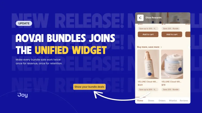
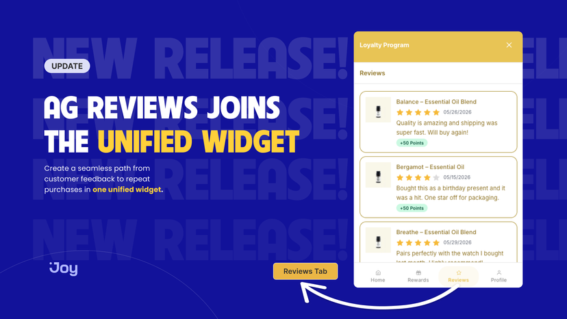
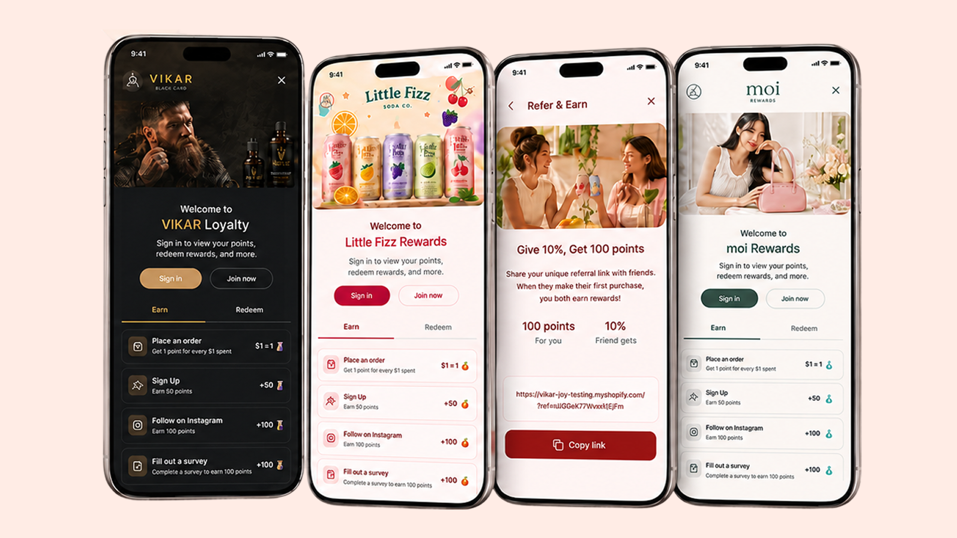
The Unified Widget is Joy's loyalty experience — floating widget, loyalty page, account page, cart drawer redeem, and points calculator — rebuilt on Lit Web Components. We call it unified because every storefront surface now runs on one codebase, one component library, and one shared design-token system. Every color, font, radius, and spacing value is exposed as a CSS design token. Every screen is composed from 39 modular blocks. The result: a widget that doesn't just sit next to your brand. It becomes your brand.
What "Lego-block architecture" actually means
The Unified Widget ships 39 web components. They compose like Shopify sections — drop in a Hero block, a Ways to Earn block, a VIP Tier block, a Referral block. Reorder them. Hide what you don't need. Theme each block independently.
The loyalty landing page alone is now 10 distinct blocks: Hero, How it Works, Ways to Earn, Ways to Redeem, VIP Tier Benefits, Referral Program, Activity Feed, FAQs, Sign-up Banner, and AI-generated Icons. Build the loyalty page that fits your customer journey, not Joy's default.
Theming via CSS design tokens — no more custom CSS battles
Every visual choice in the Unified Widget routes through a CSS custom property:
- Colors — primary, secondary, surface, on-surface, accent, with auto-contrast pairs
- Typography — font family, size scale, weight, letter-spacing
- Shape — border radius scale (button, card, modal)
- Spacing — padding and gap scale across all blocks
Set a token once at the root level. Every component picks it up through Shadow DOM cascade. Custom CSS still works — it just no longer has to fight Joy's default styles.
Faster, lighter, safer
- Smaller bundle on first paint. Components are props-driven and lazy-loaded. The FAB ships in a tiny chunk; everything else loads on open.
- Zero data risk. The Unified Widget reuses your existing business logic unchanged. Your programs, points, customers, integrations, and Shopify Flows stay untouched. Only the visual layer changes.
- Roll back any time. Don't love it? Contact support and we'll switch you back to the legacy widget the same way we switched you on. Joy never loads both versions at once.
Built for ambitious brands
If you're building a brand customers obsess over, your loyalty widget is part of your visual identity, not a software accessory bolted onto it. The Unified Widget is for stores that want absolute control over how that identity looks on every storefront surface.
It's also why this is the foundation for what's next: in 2026, the same Lego-block architecture powers the new Showcase Gallery, certified Loyalty Academy templates, and the upcoming MCP Server (so AI tools can build on Joy components directly).
How to get the Unified Widget
New stores — if you installed Joy after the Unified Widget release, you're already on it. Open your loyalty page or storefront widget to see the new design.
Existing stores — request the upgrade through our support team. Your existing branding, programs, points, and customers transfer automatically.
- In-app: open the support chat from your Joy dashboard
- Email: [email protected] — subject "Enable Unified Widget"
- Help center: help.joy.so → contact form
After we enable it, customize the new design in On-site content → Branding → Widget Design using the new design token editor.
Full documentation: Unified Widget guide on help.joy.so
Ambitious brands don't accept ordinary widgets. Now you don't have to.